
Friday, March 30, 2012
Thursday, March 29, 2012
Helvetica Writing Assignment
The typeface Helvetica originated from Switzerland in 1957. It's original name, Helveticia (Latin for "Switzerland") was eventually changed to Helvetica (Latin for "The Swiss"). Through time, this typeface brought to popularity a design style known as "Swiss Design". Other design movements that were discussed in the movie included Modernism, Postmodernism, and Grunge. Examples of Helvetica can be seen everywhere, as the typeface is used for displaying things such as advertisement posters, public signs, company logos, etc. The movie also included interviews of several designers and their personal opinions on Helvetica. Below are some examples of their work:
 |
| Wim Crouwel |
 | ||
| Matthew Carter |
 |
| Massimo Vignelli |
 |
| Rick Poynor |
Through watching Helvetica, I have learned much more about the concept of typefaces and different fonts, and how they are perceived differently by every individual. I find it intriguing how all these various fonts are presented in public, and how much detail goes into the many things that are often overlooked.
Wednesday, March 28, 2012

Wednesday, March 21, 2012
Monday, March 19, 2012
Color Theory Part C
In this unit we studied and analyzed the concept of color theory. In terms of pigment generated colors, Red, Yellow, and Blue are the three primary colors. In terms of light generated colors, Red, Blue, and Green are the primary colors. Secondary colors are created when primary colors are mixed with one another: for example, mixing blue and yellow creates green. Tertiary colors are created by mixing primary colors with secondary colors: for example, red-orange or blue green. In an aditive color model, the three primary colors of light overlap to create white. In a pigment generated subtractive color model, the three primary colors overlap to create black. Color has very intriguing effects on human psychology and the way we perceive things. For example, the color blue has a tendency to take away one's appetite/hunger, while the color pink tends to convey a sense of soothing tranquility. We learned that colors can
change in appearance in relation to one another. For example, if the color red is next to white, it appears more vivid and intense than if it were
displayed next to a different color. We also learned that a
greyscale image is one that is made up of only black and white, while a
monotone image has tints and shades of one color.
Greyscale image example:

Monotone image example:

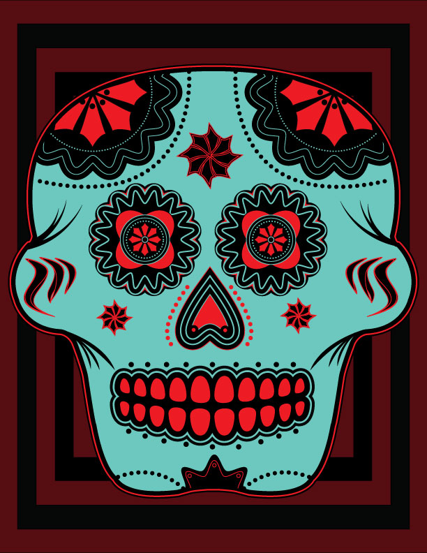
Complimentary color image example:


Wednesday, March 14, 2012
Tuesday, March 13, 2012
Monday, March 5, 2012

Subscribe to:
Posts (Atom)